Your app icon and screenshots make or break your conversion rate. Most users decide whether to tap your ad or install your app in under three seconds, and that split-second judgment happens before they read a word of your description. If you want more installs at a lower cost, your visual assets must work harder. This article shows how to turn icons, screenshots, and videos into a consistent conversion lift.
The Visual Decision Path
In Apple Search Ads results, users see your icon, title, subtitle, rating, and your first three portrait screenshots or one landscape screenshot. If you use video, it appears first. That means most paid and organic traffic judges your value at a glance.
Small changes in your icon and first screenshot can shift your tap-through rate enough to change your cost per tap. Those shifts ripple through to cost per acquisition and return on ad spend. Visuals drive your growth, not just decorate your listing.
Small changes in your icon and first screenshot can shift your tap-through rate enough to change your cost per tap. Those shifts ripple through to cost per acquisition and return on ad spend. Visuals drive your growth, not just decorate your listing.
App Icon
Your icon does two jobs at once. It's your logo and your promise. Great icons nail three things. First, they're easy to spot in crowded search results. Second, they signal your app's category without words. Third, they stay crisp across sizes and in dark and light modes.
Reduce tiny details because they blur at small sizes. Skip long gradients and thin strokes that disappear. If your category has strong visual codes like a dumbbell for fitness or a map pin for navigation, use them or subvert them cleverly. Users need to file your app in one second mentally. To avoid muddy edges, keep colors compatible with white and dark App Store backgrounds.
Update your icon carefully. Use seasonal variants only when they reinforce a campaign message in your screenshots and Custom Product Pages. Random icon changes hurt recognition. When you ship a new icon, update your first screenshots to match. Misaligned visuals make your ad card look thrown together.
Screenshots
Think of your first three portrait screenshots as a billboard you can't animate. They must answer three questions fast: What do I get? How does it work? Why should I trust it? Leading with a feature name like "Advanced Filters" forces users to guess at the value. Instead, flip it to an outcome: "Make photos look pro in one tap."
Show a clean device frame, minimal interface, and a short caption. Five to seven words work best. Large nouns and verbs beat adjectives. "Track spending. Stop leaks." reads faster than "Comprehensive smart budget analytics."
Mobile growth expert Thomas Petit emphasizes avoiding feature soup in your first three frames. Dedicate screenshot one entirely to your core job. Screenshot two should resolve an objection. Is it fast? Secure? Does it work offline? Screenshot three establishes differentiation or proof through ratings, trusted badges, or unique data sources. Most users won't see the rest of your screenshot set in the search card, so frontload your strongest messages.
Design details matter. Use high-contrast captions and large types. Maintain safe margins so text doesn't clip in different ratios. Keep backgrounds clean and consistent across your set. A coherent series feels higher quality and reduces hesitation. For accessibility, ensure text overlays have enough contrast. Don't bury key text inside your device interface because busy screens kill comprehension.
Different app types need different framing approaches. Utility apps win with outcome-first claims, simple before-and-after visuals, and trust elements around privacy or data sources. Games convert with strong character art, one signature mechanic, and a sense of progression. Subscription apps like fitness or finance must surface ongoing value and show tangible day-one results to reduce trial anxiety.
Design tools like Figma and Sketch streamline this workflow. Figma's collaborative features let your team align on visual direction faster. Use device frames as templates and keep captions as editable text layers for quick iteration. Both tools export at the required resolutions for App Store submission.
App Preview Video
Video lifts conversion when it adds clarity. It depresses conversion when it confuses or slows the scan. Use video when motion shows your core mechanic or transformation best. Keep your first three seconds ruthlessly clear. Show the end state quickly, title it in large type, and skip cinematic intros. Most viewers scan rather than watch.
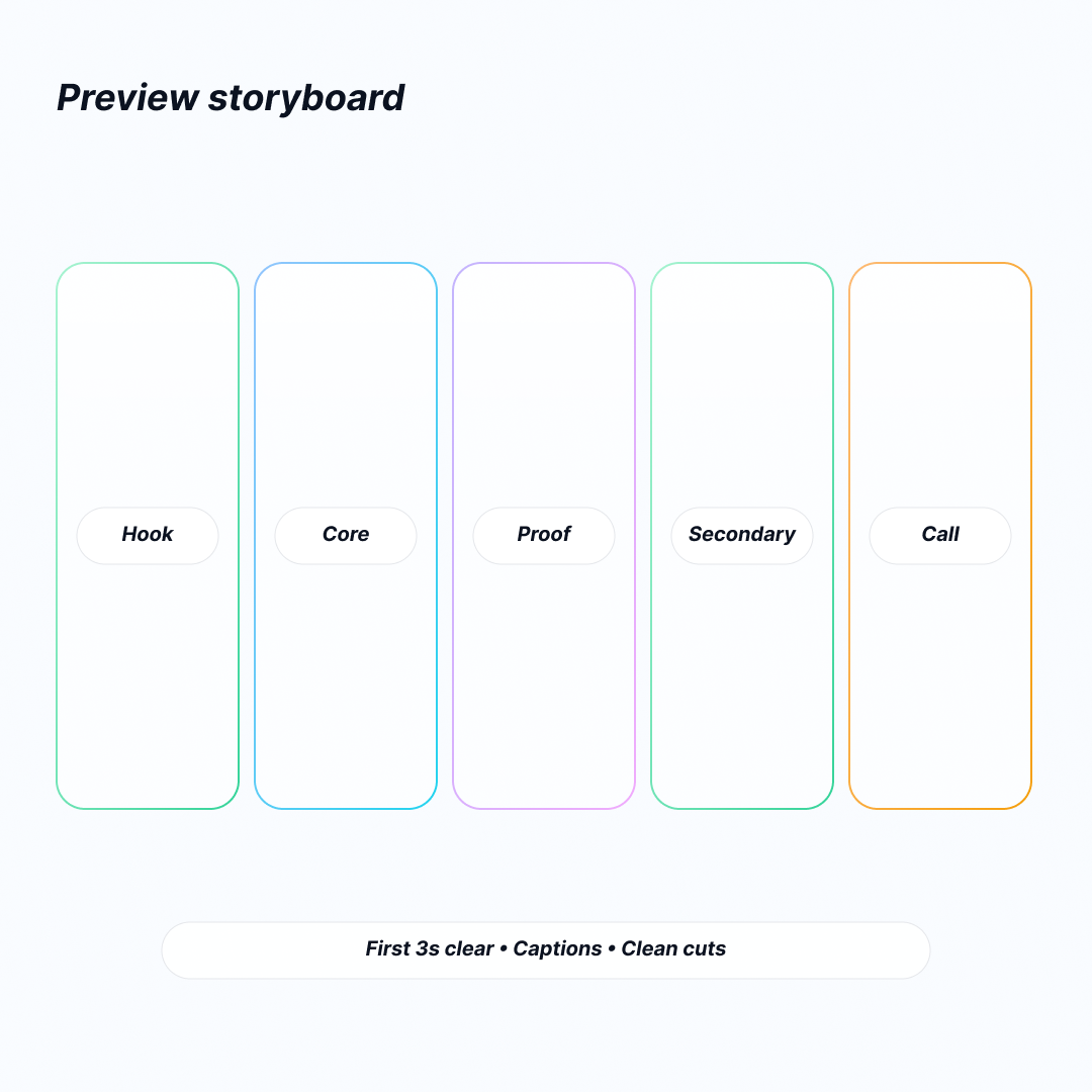
A simple five-beat structure works well: hook with your promise, show core action, add proof or social cue, demonstrate secondary action, close with a call to value. Use captions because many people view on mute. Prefer interface-native motion over heavy transitions. Keep cuts clean and reduce visual noise around key moments so eyes don't chase too many elements.
If your screenshots already tell the story well, test static assets first. Replacing great screenshots with mediocre video can lower your tap-through rate. Avoid claims you can't prove and overcrowded compositions. Don't stack tiny text. If you can't read it at arm's length on a phone, it doesn't help.
Custom Product Pages
Custom Product Pages let you publish multiple product pages with unique screenshots, videos, and promotional text. In Apple Search Ads, you map these pages to specific keyword clusters and audiences. That mapping creates a serious conversion lift.
Start with a simple intent matrix. List your keyword clusters: brand terms, competitor terms, job-to-be-done phrases like "budgeting app" or "split bills," and feature seekers like "credit score" or "receipt scanner." For each cluster, define your primary promise, the objection to address, and the proof you'll show. Design a Custom Product Page that leads with the exemplary first screenshot and caption for that intent. Your ad variations pull those assets into the search card and boost relevance.
The same approach works for audiences. New parents, students, and small business owners might need the same finance app but expect different outcomes. A persona-tuned Custom Product Page makes the experience feel purpose-built and reduces cognitive friction.
Localization
Accurate localization goes beyond translating captions. Replace idioms, adjust cultural imagery, and respect local units for currency and measurement. Choose screenshots that reflect local contexts like maps, merchants, and holidays without drifting into stereotypes. For apps dealing with money or health, align typography and color choices with local expectations of credibility.
For markets with right-to-left scripts, rebuild compositions rather than mirroring them. Persona tuning extends beyond words, too. A minimalist data-centric aesthetic might convince professionals, but it feels cold to wellness audiences. Decide your tone upfront and keep it consistent across your icon, screenshots, and video within each Custom Product Page.
Measurement
Healthy creative programs measure three layers. At the ad level, track tap-through rate and cost per tap. Watch the conversion rate from page views to installs on the product page. Downstream, measure cost per acquisition, return on ad spend, and early retention at days one and seven.
Tools like App Annie and Sensor Tower help track these metrics across segments and geographies. App Annie validates conversion performance by audience and keyword cluster. Sensor Tower tracks competitive benchmarks and identifies category trends. Both platforms integrate with Apple Search Ads for unified reporting.
A lift in tap-through rate with a flat conversion rate usually means your search card is stronger, but your product page doesn't deliver on the promise. The reverse often means you're underselling the card.
Use Product Page Optimization to run controlled split tests on your default product page. For paid campaigns, segment Apple Search Ads performance by ad group and Custom Product Page so you attribute lift to asset-to-intent mapping rather than keyword quality alone. When you find a winner, roll it into your default page only if it works broadly. Otherwise, keep it as a targeted Custom Product Page asset.
Interpret results in context. If you tighten your keyword list to higher-intent terms, conversion rate can climb even with weaker visuals. Don't credit assets for targeting changes. Isolate variables as much as the platform allows.
A Practical Workflow
Begin with research. Read your top reviews, list competitor promises, and collect common objections from support or social channels. Distill these into a creative brief with one core promise, two objections to overcome, and one proof element you can show visually.
Draft two or three narrative directions for your first three screenshots and pick one to lead. Produce variants in a tidy asset system using Figma or Sketch. Include device ratios for different iPhone sizes and iPad sizes. Mark text-safe areas and use naming that encodes version, language, and Custom Product Page mapping. Keep captions as editable text layers for speed.
Ship your first set, then schedule a Product Page Optimization test for your default page. Run an Apple Search Ads split with Custom Product Pages mapped to your highest-spend clusters. Review weekly for statistical direction rather than waiting for perfection. Retire underperformers quickly and log what message was lost. Your failure archive becomes a living playbook.
Google Play Store optimization follows similar principles but with different technical specs and user behaviors. Android users respond to various visual cues and screenshot layouts. If you operate cross-platform, adapt your core message rather than port assets directly.
Common Mistakes to Avoid
Feature soup happens when every screenshot tries to sell everything. Users leave confused. Tiny text that needs zooming doesn't work. Mixed illustration styles across your set make your brand look assembled rather than designed. Misaligned icons and screenshots break visual trust. People hesitate if your icon says premium but your screenshots look busy or dated.
Compliance risks matter too. Unsubstantiated claims and misleading before-and-after comparisons invite rejection and erode credibility. The safest message is the truest one you can demonstrate on screen.
Pre-Flight Check
Before you ship, ask yourself: Does my icon clearly signal category and match my screenshots? Do my first three screenshots tell an outcome-first story in under three seconds? Is all text readable at arm's length? Does each Custom Product Page align with a keyword cluster or persona and address a specific objection? Am I tracking tap-through rate, conversion rate, cost per acquisition, return on ad spend, and early retention by asset variant?
If you can say yes to all these, you're ready to buy traffic confidently.
FAQ
What Do People Actually See In Apple Ads Search Results, And Where Do Those Visuals Come From?
In search results, Apple Ads shows a default ad built from your App Store product page assets. It uses your screenshots and app previews, displayed in the same order you uploaded them in App Store Connect.
What Are Custom Product Pages, And How Do They Connect To Apple Ads?
Custom Product Pages are additional App Store product pages with different screenshots, app previews, promotional text, and optional deep links. Apple Ads lets you create ad variations based on these pages so the ad creative matches the landing page.
Can I Change Or Test Visuals Without Submitting A New App Version?
Yes. You can set up and manage Custom Product Pages without submitting new app versions, and you can change which page is assigned to an ad group in Apple Ads at any time.
How Do I AB Test Icons, Screenshots, Or Videos On IOS In A Controlled Way?
Use Product Page Optimization in App Store Connect to test app icons, screenshots, and app preview videos. If you test icons, include the icon variants in the app binary.
Conclusion
Your visuals are your sales team. The icon gets attention. The first screenshots create belief. The video removes doubt when it clarifies. Custom Product Pages plug those stories into the specific jobs and audiences that Apple Search Ads brings you. With steady testing and disciplined narrative design, you turn art into performance. You earn a compounding advantage: higher relevance, higher conversion, and lower cost every week you run this system.