Most ASO advice is search-heavy: keywords, rankings, and “how to climb.” Category and browse growth are different. You are not only trying to match a query, but also to win a shelf.
Browse users behave like shoppers walking through aisles. They scan fast, compare you to whatever is already in that aisle, and decide in seconds whether your app belongs there. That makes category choice and store-page packaging tightly coupled.
If you pick a category where your value is unclear, your conversion rate drops, and you end up with a slow, expensive loop: fewer installs → weaker momentum → fewer browse impressions.
A useful mental model is the browse funnel:
You do not need to guess the algorithm to make this funnel work. You need to treat the category as positioning, and treat the store listing as a browse-first pitch.
Browse users behave like shoppers walking through aisles. They scan fast, compare you to whatever is already in that aisle, and decide in seconds whether your app belongs there. That makes category choice and store-page packaging tightly coupled.
If you pick a category where your value is unclear, your conversion rate drops, and you end up with a slow, expensive loop: fewer installs → weaker momentum → fewer browse impressions.
A useful mental model is the browse funnel:
- Browse impression (category page, chart, collection, event card)
- Store listing tap
- Install
- Early usage (activation)
- Retention and ratings
- More visibility (because your listing converts and users stick)
You do not need to guess the algorithm to make this funnel work. You need to treat the category as positioning, and treat the store listing as a browse-first pitch.
Where Browse Traffic Actually Comes From
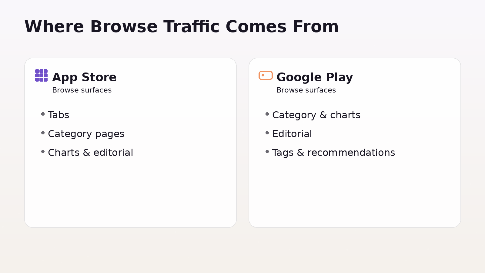
App Store browse surfaces
On Apple’s side, categories are not just metadata. Apple explicitly notes that your primary category is the one where your app appears when users browse categories or filter search results, and it influences placement under the Apps tab or Games tab.
So browse visibility on the App Store typically comes from:
- Apps/Games tab placement
- Category pages
- Charts inside categories
- Editorial collections and feature stories
- “Filtered search” behavior (users searching, then narrowing by category)
Google Play browse surfaces
Google Play is similar, but it adds a key ingredient: tags. Google states that categories and tags help users discover relevant apps, and you can add up to five tags.
Common browse discovery on Google Play comes from:
- Category browsing and top charts
- Editorial collections
- Situational shelves (for example, “recommended for you” style surfaces)
- Category + tag clustering (you want to be grouped with the right neighbors)
Picking the Right Category (Positioning + Competition)
Both stores let you choose categories, and Apple lets you assign two categories (primary and secondary). The primary one is the biggest decision because it defines your main browse aisle.
A strong category choice balances three things:
Relevance
If users in that category do not instantly understand why you belong, your conversion falls. Browse users are less patient than search users.
Competitive set
You are choosing your comparison set. Your icon and screenshots are judged against the top apps in that category, not against your internal roadmap.
Merchandising fit
Features and collections tend to be curated around recognizable themes. If your category is “technically allowed but visually odd,” you are harder to merchandise.
A simple way to decide:
- Pick 10–20 apps that look like your closest alternatives.
- Pick 10 aspirational leaders you want to be compared to.
- If those lists live in different categories, you have a positioning problem to solve (product messaging, not only ASO).
Designing a Browse-First Store Presence
Browse users make a decision before reading. Your goal is to communicate three things immediately:
- What it is
- Who it is for
- Why it is better or different
That happens mostly through:
- Icon (category credibility + brand cue)
- First 1–3 screenshots (the core promise)
- Short description / subtitle style (clarity, not cleverness)
- Preview video (only if it makes the promise faster than screenshots)
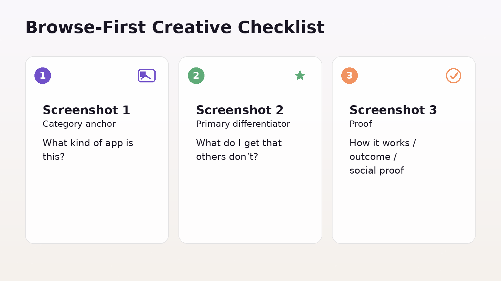
A browse-first creative approach usually looks like this:
- Screenshot 1: category anchor (“what kind of app is this?”)
- Screenshot 2: primary differentiator (“what do I get that others don’t?”)
- Screenshot 3: proof (“how it works, outcome, or social proof”)
Then support layers: features, depth, edge cases, pricing, trust.
If you do only one thing for browser growth, make the first screenshot and icon “category-native.” You can still be unique, but you need to feel like you belong.
Personalization and Experimentation for Browse Audiences
Browse growth becomes much easier when you stop treating the store page as a single, static artifact.
App Store: Product Page Optimization + Custom Product Pages
Product Page Optimization (PPO) lets you test up to three alternate versions of icons, screenshots, and previews against your original, and measure performance in App Analytics.
Use PPO for broad questions like:
- Which promise converts better for cold users?
- Which visual style reads faster in a category shelf?
- Which icon increases taps from browser impressions?
Custom Product Pages (CPPs) let you publish additional versions of your product page and share them via unique URLs. Apple states you can publish up to 70 additional versions, and you can vary screenshots, promotional text, and previews.
Two advanced CPP use cases matter for growth:
- Campaign-message match: every paid or social campaign gets a page that mirrors its promise.
- Intent variants: different feature-led pages (for example, “budgeting” vs “investing”) so browse-like audiences see the most relevant pitch.
Apple also notes you can assign keywords so a CPP can appear in search results instead of your default page, and that deep links for CPPs are supported in iOS 18/iPadOS 18 or later.
Google Play: Store Listing Experiments + Custom Store Listings
Store listing experiments are Google Play’s native A/B testing for store listings. Google positions it as a way to optimize your listing by testing graphics and localized text.
Treat experiments like PPO: run them continuously, one big question at a time.
Custom store listings (CSLs) are the Google Play equivalent of “multiple storefront pitches.” Google says CSLs let you tailor your listing to specific user segments or traffic sources, including users who visit via a unique URL.
Google Play also highlights that you can create up to 50 custom store listings.
A strong segmentation strategy for CSLs:
- By country/region (local trust signals, payments, use cases)
- By campaign (message match)
- By keyword intent (when available via targeting options)
- By lifecycle (win-back vs new users)
The growth pattern is the same on both stores: personalize the pitch, then test and standardize winners.
Turning Browse Visibility Into Sustainable Growth
Browse surfaces tend to reward momentum. You do not need to treat this as a mystery. Momentum is usually created by:
- Better conversion (more installs per impression)
- Better early retention (users keep and use the app)
- Stronger trust (ratings, reviews, low friction onboarding)
So the sustainable strategy is:
- Make your category choice defensible
- Make your listing convert for that category
- Build a testing system (PPO/CPP, experiments/CSLs)
- Create periodic spikes that bring new users in, while product quality keeps them
Do not chase spikes without conversion work. A burst of low-quality installs can actually leave you worse off if it drags down ratings or increases refunds/uninstalls.
Using Events and Campaign Hooks to Win Browse Surfaces
On the App Store, In-App Events are explicit browse inventory. Apple describes them as appearing across the App Store as event cards, and they can be created and submitted independent of an app update.
Apple also notes limits like having up to 10 events visible on the App Store at a time and up to 15 approved in App Store Connect at a time.
A practical way to use events for growth:
- Tie them to real user value (new feature week, challenge, drop, live content)
- Package them like media (clear title, visual hook, short description that says “why now”)
- Coordinate creatives: event card theme matches your store page story and any CPP pages
On Google Play, the equivalent “hook” is usually campaign continuity through CSLs, plus frequent store listing experimentation and seasonal creative refreshes that keep your shelf presence current.
Quality Signals That Affect Browse Performance
You do not need to obsess over ranking factors, but you should treat quality as part of browse growth because it impacts conversion and trust.
Focus on:
- Ratings strategy (timing prompts after value moments, not after signup)
- Review velocity (steady inflow beats occasional surges)
- Performance basics (crashes, slow startup, broken first session)
Browse users are colder. They rely on cues like rating, visual polish, and clarity more than search users who already want something specific.
How to Know Browse Is Working
Your measurement goal is simple: separate "browse improvements" from "search improvements."
Track:
- Browse impressions and product page views (per store's analytics views)
- Conversion rate (page view → install)
- Install quality (activation rate, day-1 retention, day-7 retention)
- Ratings and review trends after creative changes
When you run tests (PPO, store listing experiments), log:
- Hypothesis (what you changed and why)
- Primary KPI (usually conversion)
- Guardrail KPIs (retention, rating trend, refund/uninstall signals if you have them)
Browse growth is iterative. The winners are rarely clever. They are usually clearer.
FAQ
How Do I Know If I Picked The Wrong Category?
If product page conversion stays well below your baseline and reviews mention mismatches like "I expected X but got Y," your category is likely wrong. Another sign is your icon, and screenshots look out of place next to the top apps in that category.
Should I Optimize Category Before Keywords?
If most growth comes from browse, optimize category fit and first impression assets first. If the search is strong, work on both, but category still matters for filtered search and browse surfaces.
How Many CPPs Or CSLs Should I Create?
Start small with 3 to 10 CPPs or 5 to 15 CSLs in your highest-impact markets and intents. Scale only where you can measure lift and keep pages updated.
What Should I Test First?
Test the first impression layer first: icon, screenshot order, and the main headline or promise. These changes usually move conversion the most.
Do Ratings Matter For Browse Growth?
Yes. Strong ratings and recent reviews increase trust among new users, improve conversion rates, and can support broader visibility.
Conclusion
Category and browse growth isn't about chasing charts; it's about earning your place on the shelf.
Pick a category where your value is instantly obvious, package the app like the best performers in that aisle, and run continuous tests to improve conversion.
Then use personalization (CPP/CSL) and timely hooks (events, seasonal beats) to create repeatable momentum without sacrificing install quality.